Saturday, 23 April 2011

FINAL LOGO


Sometimes keeping a logo simple works better than making it technical. Just using a font makes this logo look feminine, stylish and perfect for the audience i am targeting.

Product concept 1

Now i have made my logo, i now need to start thinking about the product and the design of the can. I will now look at some packaging/brand design and come up with a concept.


I think by now everyone knows i love swirls and clean vector designs, this is presented well and looks very professional, my only problem is getting the design onto the bottle?


Looking at different ways i could hold my liquid drink, i dont think the fiz would last in this though.


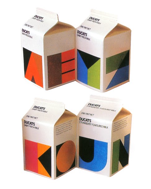
Nice simple designs, looks clean, professional and i like how the product makes you think its a refreshing drink just by looking at the design.


More clean vector swirls this looks great, and also i think this targets a female audience well. Colours are nice, the shape of the bottle is funky and just looks different to other bottle designs out there.


Ok i have looked at some designs for cans, but for my first concept idea i have come up with using illutsrations similar to how fashion artists create there dresses and sketches. Here are a few examples of what i mean then i will start on my own sketch work.

I like the white matt look these cans have, however they look to similar to innocent smoothies, and i feel people would confuse them for this other brand.


For my first concept i want to make a photomontage of my own sketches, going through a storyboard of a typical students life.

What do students do?

-STUDY
-PARTY
-SOCIALISE
-SLEEP

CONCEPT 1


As you can see, this style isnt working. I still want to use a woman in my design but i think making a photomontage on a can doesnt work. I think i will keep to this style and try a different concept out.

Friday, 22 April 2011

concept 2


rough sketches of swirls, bubbles and female designs. I do like these and think i will spend a few hours just messing around on the computer with these designs.

Thursday, 21 April 2011

Asking my audience

To get a better idea of what i am trying to design i have gone and asked a few of my female friends what they think should my can should have on it. i will now bullet point a few of there suggestions.

- different shape can
- pink
- female body
- create a can in an illustration like they do for dress concepts.
- swirls
- bubbles
- charities
- healthy drink
- slim can
- silver

As i only have little time, i couldnt really do a questionnaire but some of these answers are great. I really like the idea of promoting a charity? and changing the shape of the can.

Wednesday, 20 April 2011

CONCEPT 3

Ok so this is concept 3 and I have been doing a bit of research over the internet and these images popped up. I love how this style of work combines with my first concept. Instead of making a photomontage of things students do, i could just select one thing and create a pop art style design.


FEW IMAGES WHICH I THINK WILL PROMOTE THIS NEW DRINK WELL.

I am starting to really like this concept. The cans are beautiful i love how they tell a story within the womans face. I have found a few images which i will turn into a pop art style. Each image to me represents a student, but also shows fun, happiness etc.


SKETCH WORK